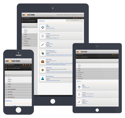
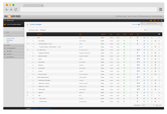
Welcome to Simplex
Simplex Theme has been created to demonstrate HTML5 and CSS3 functionality within CMS Made Simple™.
It is shipped with a CSS Framework making it possible for you to create Responsive and Mobile capabale layouts with ease.
What is included?
With this Template you will find four Stylesheets attached to it.
- Simplex Core
- Simplex Layout
- Simplex Mobile
- Simplex Print
Main Functionality of this Template is included in Core Stylesheet. It contains a simple Fluid Grid Framework based on 960 Grid System.
In this same Stylesheet CSS Media Queries are being used that make it possible for a flexible layout based on Screen width.
With Simplex Theme it is very easy to quickly change appearance of complete Site at once. If you look at Page Template code you will find "boxed" id in the <body> tag.
When this id is removed the Layout of the Site is changed and you would face a simple layout with White background.
You can also quickly change allignement of the complete Site. If you change the class of "wrapper" div to leftaligned or rightaligned, whole Page will be aligned to left or right.
Support for Mobile Devices
As mentioned above this Theme is shipped with Stylesheet Framework that gives you a starting point for easy developement of Responsive Layout.
Mobile world is very versatile and Framework itself is by no means perfect, it is only a starting point but as a Developer you should decide which technique you should use for your current Project.
Responsive Template is only one small step towards Mobile support.
This Theme requires jQuery which is included with {cms_jquery} tag.
Note: {cms_jquery} tag is included at the bottom of the Template. You should be carefull with it when you are using Modules that include jQuery in <head> section.
In file functions.js a section is included that makes it possible of Navigating through site with some Mobile Devices. This part of the code, covers only few devices and it is only meant as an example and a starting point for Developer.
This and that
As an example of Smarty power within CMS Made Simple™ Templates a very simple Slider has been included, which demonstartes how easy it is to quickly create a Slideshow without a single Module.
{assign var='teaser' value='uploads/simplex/teaser/*.jpg'|glob}
{foreach from=$teaser item='one'}
 <div><img src='{root_url}/{$one}' width='852' height='275' alt='' /></div>
{/foreach}
If you would like to make this Slider responsive you should include a additional jQuery Plugin like for example SwipeJS
In included Stylesheets, Smarty has been used as well. This should make it possible for you, to quickly change Color scheme of the theme by simply changing HEX code within assign Tags.
[[assign var='boxed_bg' value="#d1d1d1 url(`$path`/boxed-bg.gif)"]][[assign var='light_grey' value='#f1f1f1']]
[[assign var='grey' value='#e9e9e9']]
[[assign var='dark_grey' value='#555']]
[[assign var='white' value='#fff']]
[[assign var='orange' value='#f39c2c']]
[[assign var='dark_orange' value='#e6870e']]
[[assign var='yellow' value='#fdbd34']]
If you are using a modern Browser, you will notice that the Theme is using some of CSS3 techniques. There are no Internet Explorer fallbacks included but this doesn't mean that it does not work in Internet Explorer.
A Visitor that is using Internet Explorer will simply see a Layout with gracefull fallback, meaning animations will not animate, rounded corners will be edges...
Note from Theme Develper Goran Ilic (uniqu3e):
The Simplex Theme was kept simplistic which should make it possible for a Developer to easily read code used in Theme and either create a new Layout from it or editing this Theme.
A full Internet Explorer or Mobile support was intentionally not included, as each Developer should decide how far a old Browser like Internet Explorer (7,8) or which Mobile devices he wants to support and which Technique he will use.
Each Project is different and with each Project there is a need for different techniques.


